
Comments
-
UC Davis Athletics Joining Mountain West - Football to Follow
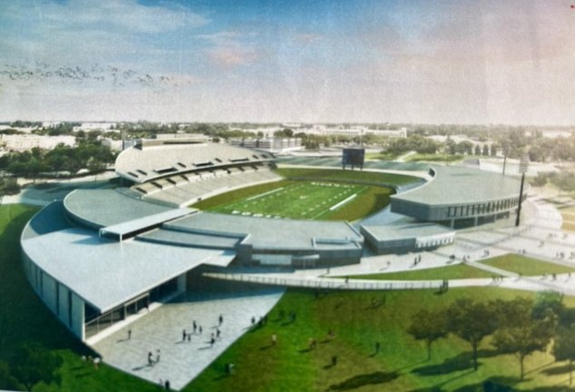
This is more accurate on how a the stadium will look. The right side is in progress with the new club section/ suites. -
UC Davis Athletics Joining Mountain West - Football to FollowDavis is building something similar to a club area that’s the $50mm right now.
-
UC Davis Athletics Joining Mountain West - Football to FollowCan the people going to the wine tasting fundraising event ask the following questions.
1. What is the timetable for us to move to FBS.
2. How much funding has been secured for football stadium upgrades.
3. What is the timetable for FB stadium upgrades.
3a. How long for the new boxes.
3b. How long for seating expansion and other amenities.
The admin will give answers to those donating money. -
UC Davis Athletics Joining Mountain West - Football to Follow23 million to join the MAC is crazy. But at the end of the day, the goal has sort of been achieved. But then again Sac State is in. Now SAC State has a head start on securing the SAC market. They already have national attention…
-
UC Davis Athletics Joining Mountain West - Football to FollowHere’s the “arena with bleachers not retractedAttachment
 IMG_4211.webp
(427K)
IMG_4211.webp
(427K)
-
UC Davis Athletics Joining Mountain West - Football to FollowDavis is making the right move of securing funds before moving to FBS. Idk what Sac State is doing… their new basketball “arena” is just retractable seats inside their student rec center… I wouldn’t have have high hopes for a stadium that could generate revenue

-
UC Davis Athletics Joining Mountain West - Football to FollowNDSU has been winning for years, UCD is just now getting serious about football recently… trending upward. I’m a Cal football fan, look at what they are doing, a lot of positive momentum.
-
UC Davis Athletics Joining Mountain West - Football to FollowIdk why everyone is questioning attendance when Davis broke their attendance last season with 17k fans in attendance… In a 10k seat stadium… playing a FCS team. Attendance will be fine when the move up happens in a couple years. As long as the on field product is good, people will be interested. The admins still have work to do to make the game day experience and advertising up to par.
Anyone responding please add what needs to be done to make it work, not why it won’t work. We should always try to add what needs to be improved instead of why it won’t work. It’s fine to be realistic about things not being great now but the school is moving in the right direction. -
UC Davis Athletics Joining Mountain West - Football to Follow
This is a problem if correct, as the streaming revenue was supposed to go to the schools?
So what is UCD doing to maximize revenue????
https://youtu.be/zEvXGZgNcL8?si=kleAPrygqVRtyD6G
(Link to Big Mountain Podcast explaining MW media deal) -
UC Davis Athletics Joining Mountain West - Football to Follow
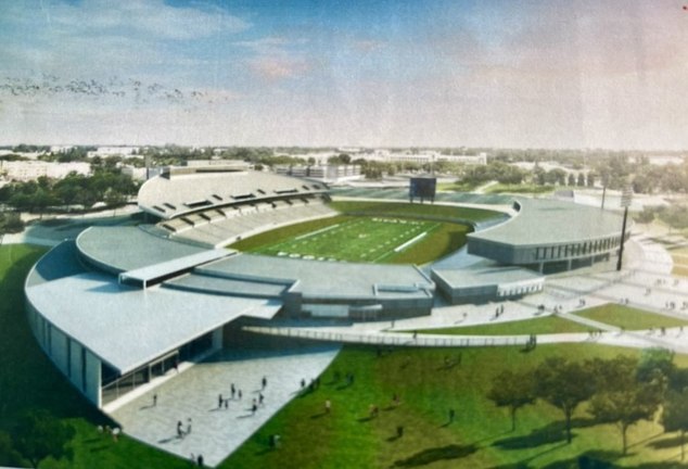
This was the image the AD tweeted a couple of years ago. We’re currently working on the right half. I wonder if they’ll add boxes to the left side as well (under the second deck). -
UC Davis Athletics Joining Mountain West - Football to FollowI don’t know why Davis doesn’t have a digital bill board on I80 to advertise. Could have one on both sides of the freeway.
-
UC Davis Athletics Joining Mountain West - Football to FollowMountain West teams 2026 :Air Force, Hawaii, Nevada, New Mexico, San Jose State, UNLV, Wyoming, North Dakota State, Northern Illinois.
Big Sky: Cal Poly, Eastern Washington, Idaho, Idaho State, Montana, Montana State, Northern Arizona, Northern Colorado, Portland State, Southern Utah
Utah Tech, Weber State
All MW schools are bigger brands than the FCS schools. As I said sports are just entertainment at the end of the day. And people want to see big brand entertainment.
In the mountain west we can schedule up to 12 FBS teams ( maybe 1 or 2 FCS teams but gotta pay them to play). So not only will we play bigger brands in the Mountain West but we can schedule other teams too. Imagine hosting San Diego State or James Madison in Davis. Or Fresno State. People would come out to watch that. -
UC Davis Athletics Joining Mountain West - Football to Follow
1. They need to hire a local DJ to get a playlist together to get the music together. Have the band play between downs and music play during timeouts. Nor cal music
2. Get someone to lead the student section in chants.
3. Have the team runout to music and pyrotechnics. Maybe pyrotechnics from water tower after touchdowns and wins? Actually would be cool if a horse led the team out.
4. Have billboards for Davis sports around Fairfield up to Sac. Advertise on TV. Run Facebook/ IG and YouTube adds High school teams and pop warner teams should get tickets. Get young people excited about going to games. Again, the attendance won’t really skyrocket until football is moved to FBS. Only die hard fans care about FCS football. As you can see how bad attendance drops in the playoffs. Can’t depend on students to fill the stadium.
5. Get better food options. I like Woodstock’s but there needs to be more. When they expand the stadium they need to add permanent concession stand.
6. Update the stadium store. It is bad. (I see Davis had been upping their game on apparel tho. Need more alumni gear. I only buy sweatshirts if they’re embroidered. Screen printing is cheap)
7. Do some cool video board graphics
I’m sure many others will have other suggestions on what Davis can improve on their game day experience. It would be good for others to share their suggestions as reply. -
UC Davis Athletics Joining Mountain West - Football to FollowPart of the reason that nobody goes to games is because the game day experience sucks and they don’t market sports well at all. Along with the fact FCS football isn’t going to be popular with the 49ers, Cal, Stanford all in the area playing big name football teams. At the end of the day sports is just entertainment and going to a Davis game is no where near entertaining. Whoever picks the music for the games should never do it again.
-
Needed Updates to the Football Uniforms / FieldAlso, another serious upgrade to the stadium would be ribbon video boards around the inside rim of the stadium. This is revenue producing as they can run advertisements during the game.
-
UC Davis Athletics Joining Mountain West - Football to FollowGonna keep it real, if Davis gets the funds to upgrade the football stadium and doesn’t move to FBS, imma be pretty disinterested in watching Davis football. Especially knowing moving up to FBS is the goal and they have first dibs on moving up to the MWC for football.
-
UC Davis Athletics Joining Mountain West - Football to FollowNo team will move to MW before Davis. It is in MW contract Davis has first consideration to move up to MW for football. Any other FCS team moving up to FBS/ MW will do so alongside Davis. ND State and Tarletan State and who are rumored to also move up with Davis.
-
UC Davis Athletics Joining Mountain West - Football to FollowIn my opinion we have to move up to FBS to be competitive in football. We need the TV revenue. Donors will be more willing to donate to watch us play FBS level competition. The average person would be happy to go UC Davis Health Stadium to watch the football team play UNLV, San Jose State, Air Force, Hawaii, New Mexico over playing teams like Northern Colorado, Northern Arizona, and other directional schools. We don’t even have Sac State in conference anymore. THE BRAND MATTERS. Growth is uncomfortable.
Davis is in the #20 tv market in the USA, the biggest one without a pro football or FBS team. 15 years from now if Davis can be competitive, I could see the school pushing for P4 status… tv ratings talk. But it all starts with at least getting FBS, which Davis is looking to do. (Per the Big mountain Podcast, we’re looking at a 2029 move. https://x.com/tbm_jy/status/1890812691813400686?s=46 )
I don’t get how people can say “CAL thinks they’re better than us” but don’t want to move up. I’m ready to compete with CAL and UCLA. Indiana has shown us that any school can compete now. We have a wealthy alumni base. The school just needs to get them something to be excited about. And it starts with Football.


Akiltopmack99

Start FollowingSend a Message
- Terms of Service
- Useful Hints and Tips
- Sign In
- Created with PlushForums
- © 2026 Aggie Sports Talk