-
fugawe09
382so tomato would actually have a cool tie in to Aggie Stadium — prior to the 1950s tomatoes had to be handpicked and didn’t travel well. The agriculture mechanics department helped develop mechanical harvesters and UCD plant scientists had to develop tomatoes with thicker skins that could withstand mechanical harvesting and trucking, known as the “square tomato”, which is what we rely on today to have tomato products year around. At the time, Hutchison Dr was lined with tomato fields and the researchers threw the tomatoes at the road to select the ones that didn’t splat as bad. Maybe could have a modern tomato toss outside the stadium. It would be pretty close to the actual spot. -
 Sailorgabe
209OMG I love this idea!! I live in Spain half the year, and they have the a tomato fight festival that is so much fun. We should totally do a tomato fight either before or after a game....the kids would love it
 -
 NCagalum
392The varieties were given names such as UC - 82. Besides being fleshier (tougher) they are a determinate set type so they ripen mostly all at once which is important for contracts with canneries. I worked at a Contadina plant in Riverbank summers while going to school. I could hardly believe I was making the grand wage of $4/hr back in the late seventies. To this day I pick out Contadina sauce and paste at grocery stores (even on east coast) for old times sake.
 -
 Akiltopmack99
40
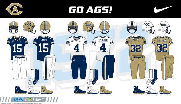
I saw these online and these would be a great update to the football uniforms. I want our school to be the best in every area of football while we work on becoming relevant and competitive during/ after our move up to the FBS. -
 Pacifico2
219I agree with your Equestrian take, but these uniforms are way too Montana State for my taste
 -
 SochorField
612Love our current uniform and helmet combos. Davis script helmets will never go away.
 -
 Akiltopmack99
40I don’t see why they can’t do a white helmet but make the CA logo cow print. Davis has Tahoe unis… idk who thought that was a great idea.
 -
 69aggie
424On a little more serious note, how about converting the old turf field to natural grass? To actually give the players a safer place to play. Cost: $400,000 to $800,000+/-. Is it possible for the university to leverage its ag connections and its own skilled ag departments expertise into a much lower cost? Maybe even having the teams using the field to help with the labor like the soccer people did way back in the day. Imagine if a local turf grower could have its name on the stadium floor that said “This grass field is courtesy of "………..” grass turf company. I think we could rustle up $400,000 to do this pretty easily. Thoughts. Oh, and to satisfy the cow guys, let the cows and sheep graze the field. Save on mowing and fertilizer! Is that not a “Win win”?
 -
 Riveraggie
412
It seems they replace the turf about every 7 years. The current turf was installed in 2022. In a few years they are going to be faced with replacing the turf, then they can consider the difference in cost. -
 Akiltopmack99
40I like the cows a lot, I visited the cows often. That being said I actually think if the team should align themselves with any animal it should be the horses. I like horses a lot too. I also like the Maggie the Aggie entrance for the football team. (They should add some pyrotechnics too and have the band line up on the field). I just don’t see any reason to object to cow stuff when it’s an agricultural school.
Second, grass is best, I’m against turf football fields. The practice field is grass so the game surface should be grass. Again, this being an agricultural school, why do we not have natural grass. -
 BlueGoldAg
1.6k
 -
 Sailorgabe
209I've always said we should embrace what we are good at. Wine. We are the best viticultural program in the world. We are not just "Aggies" we are Wine Makers. If we started pushing that, nobody in the world could compete with us, because we are the best wine making school in the world.
Welcome to Aggie Sports Talk!
AggieSportsTalk.com, the pulse of Aggie athletics. The home of Aggie Pride. Create an account to contribute to the conversation!
More Discussions
- Terms of Service
- Useful Hints and Tips
- Sign In
- Created with PlushForums
- © 2026 Aggie Sports Talk


